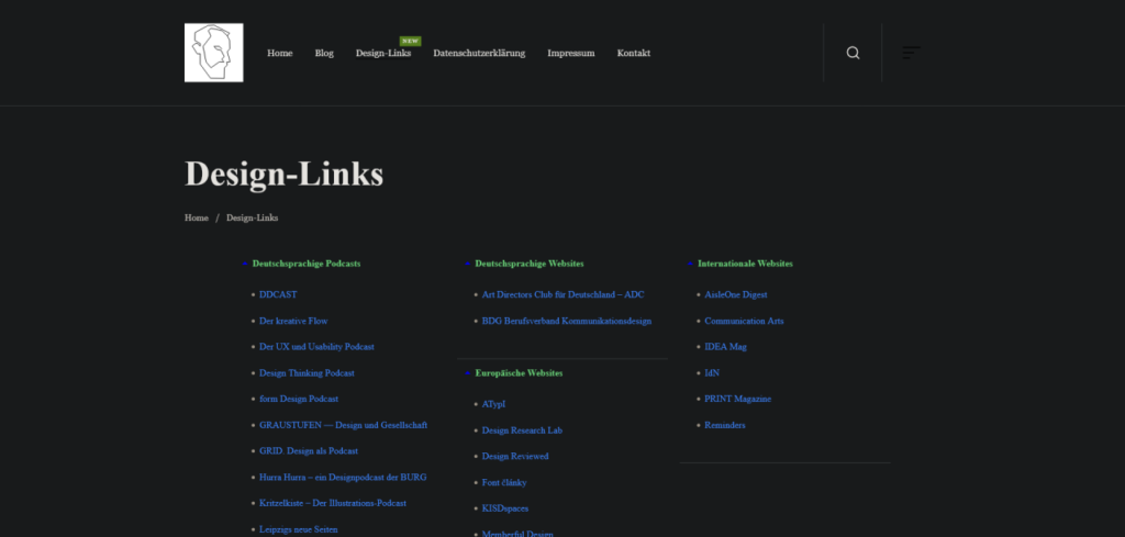
Over the last few days, I went from not having a website to having my own website, having a social wall, having a blog, and basically linking everything to everything.
I have also added a blogroll, so that people can actually leave my website following their own urge to surf the web.
But I think the most radical thing I did was take inspiration from an ebook I am currently reading: Interpassivity, by Robert Pfaller, or rather from the way it looks and reads, if this verb allows for being changed into something an object does, instead of being something done with an object you can read.
Ebooks are, similar to how apps are these days, wrapped web pages: they are basically html and css (and javacript, if you look at apps).
So I studied why I found this ebook such easily readable, and it turns out that it is for the simple fact, that, all by itself, it was set to display in Times New Roman. Should that typeface not exist, then it would be displayed in Times, and if that, too, should fail, just a Serif typeface (like I first tried with Georgia, but I really didn’t like Georgia’s bombastic medieval numerals, it felt like a winery!).
There is still some tweaking to be done (based around my knowledge of typographic detail and grids, I need to take a second look at line height and how far paragraphs are spaced out vertically), but having done this change all I can say is that I am amazed by how readable my website and my blogged articles suddenly are.
It honestly feels like doing something new, because basically everyone is doing the custom typeface, sans‑serif for everything, really, while, what I think, the eye of the reader suffers for it.
The screenshots above were made while my Dark Reader plugin was active, so don’t be surprised that the real thing looks different 😉
There is also this bonus effect of how Serifs are connected to authority, and despite what the Bauhaus nerds tell us graphic designers in a top‑down abstraction, authority is good, especially if it comes for free by increasing the readability.
Source: My after‑hours blog on Tumblr Code & Canvas


Schreibe einen Kommentar